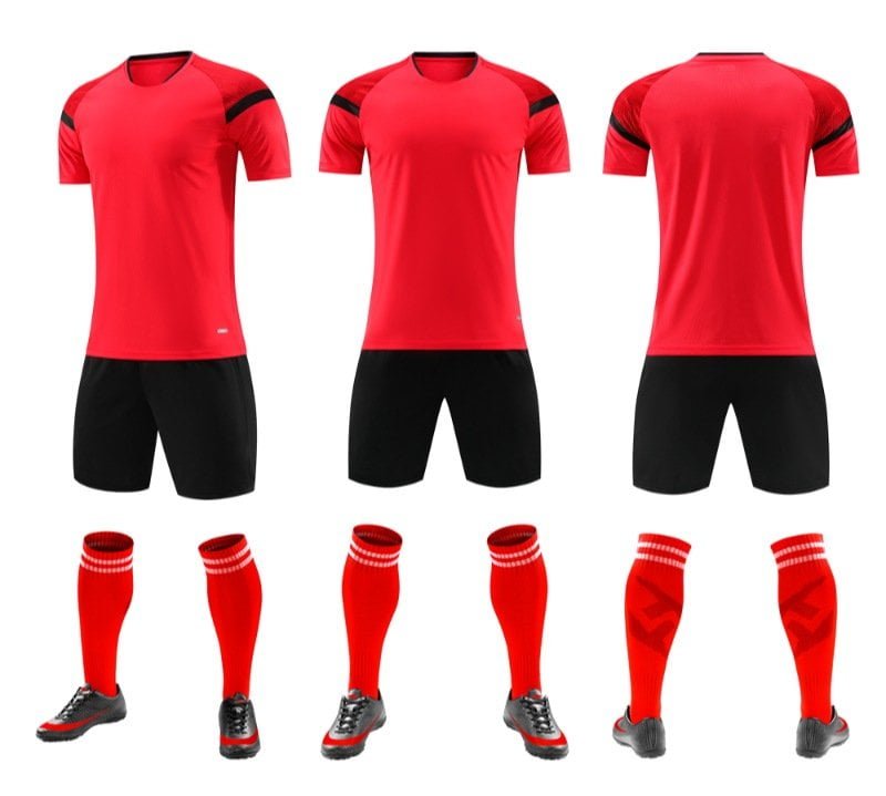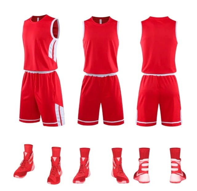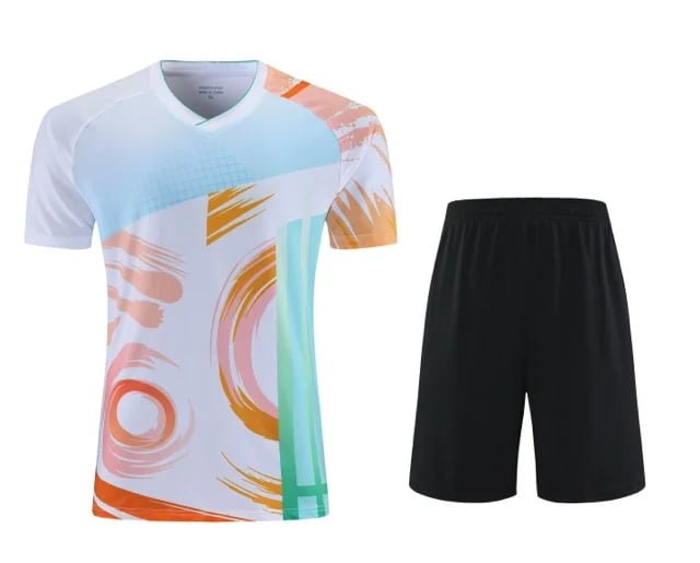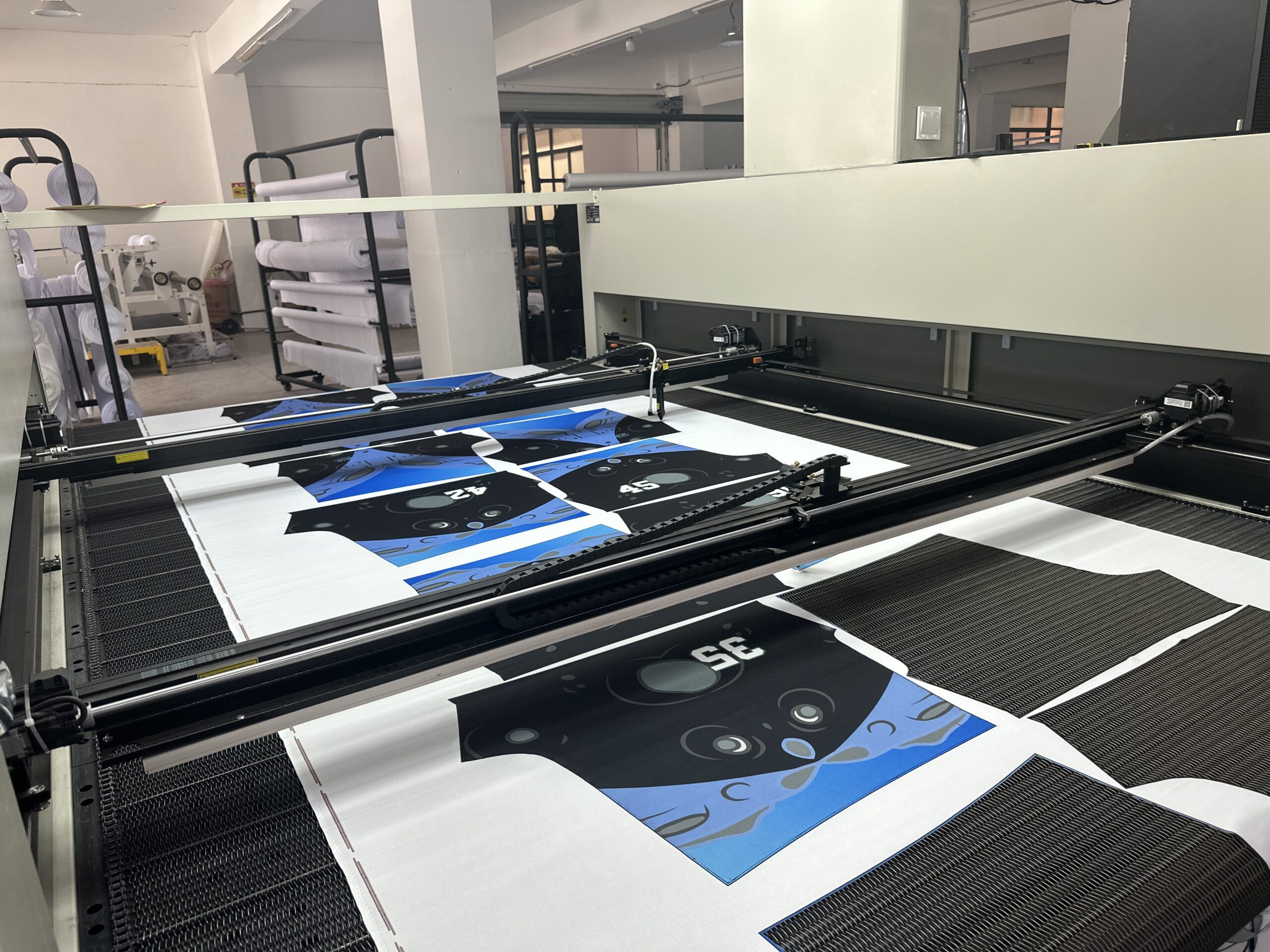
One of the most common concerns in custom sportswear production is color consistency.
A team approves a design on screen…
But when the physical jerseys arrive, the colors may look slightly different from what they expected.
This situation is more common than many buyers realize — and in most cases, it is not caused by poor production.
Color appearance in football kits is affected by multiple technical factors throughout the production process.
Understanding these factors helps reduce misunderstandings and improve communication between buyers and suppliers.
Colors on Screens Are Not Always Accurate


One of the biggest reasons for color differences is simple:
Screens display colors differently.
The same design may appear different on:
- Phones
- Laptops
- Tablets
- Different monitor settings
Brightness, contrast, display calibration, and ambient lighting all affect how colors appear digitally.
This is why a jersey color viewed on screen can never be treated as a perfect physical reference.
Fabric Type Changes Color Appearance
The same ink can look different depending on the fabric itself.
For example:
- Smooth polyester may appear brighter
- Jacquard fabrics may create more texture and shadow
- Different fabric structures reflect light differently
Even when using identical color files, the final visual effect may vary slightly across materials.
This is completely normal in textile production.
Lighting Conditions Matter More Than People Think


Colors may also appear different depending on lighting conditions.
A football jersey can look:
- More saturated under sunlight
- Cooler under white LED lighting
- Warmer indoors under yellow lighting
This is why professional color evaluation is usually done under controlled lighting conditions.
Pantone References Help Improve Accuracy
For projects where color accuracy is especially important, Pantone references are strongly recommended.
Pantone codes provide:
- A standardized color reference
- Better communication between buyer and supplier
- Reduced uncertainty during production
Without Pantone references, suppliers often rely on screen visuals or photos, which increases the risk of color variation.
Why Sample Approval Is So Important


This is one of the main reasons pre-production samples matter so much.
A physical sample allows buyers to confirm:
- Actual fabric color
- Material texture
- Logo visibility
- Overall visual balance
It is much easier to adjust colors before bulk production than after.
Minor Color Variation Is Normal in Textile Production
Even with professional production control, slight color variation can still happen.
Possible factors include:
- Fabric batches
- Dye absorption differences
- Printing temperature variations
- Lighting environments during inspection
In textile manufacturing, the goal is consistency within acceptable tolerance — not absolute digital perfection.
Good Communication Reduces Color Problems
Most color issues can be minimized through:
- Clear Pantone references
- Proper sample approval
- Realistic expectations
- Early communication
The more clearly both sides align before production, the smoother the project becomes.
Our Approach to Color Control
At Coolware, we understand how important color consistency is for clubs, brands, and sports organizations.
To reduce risks during production, we focus on:
- Careful fabric selection
- Sample confirmation before bulk production
- Color checking during QC
- Clear communication throughout the process
Because in custom sportswear production, details matter — especially when it comes to color.
Planning Your Next Football Kit Project?
If you’re preparing custom football kits and want to reduce production risks from the beginning, we’d be happy to help.
At Coolware, we support clients with:
- Fabric recommendations
- Sample development
- Color confirmation
- One-stop production coordination
👉 Feel free to reach out if you’d like to discuss your next project.